
Plover: The Progress Bar That Works
A local-first desktop agent that turns a vague goal into a structured plan and shows the same kind of live, closing-the-ring progress a Fitbit shows a runner — applied to work that's mentally, not physically, demanding.
Fitness trackers solved this for the body. Nothing solved it for the desk.
A ring, a streak, a percentage closing in real time as you move — fitness trackers solved motivation for physical effort years ago. Knowledge work has no equivalent. "Finish the methods section" or "ship this feature" has no obvious next physical action, no ambient feedback loop, and no visible signal that you're 65% of the way there instead of 15%.
Plover's core bet: if you can build a system that reads what someone is actually doing and reflects it back as a filling bar, you can borrow the exact mechanism that gets someone to close their rings — and point it at a thesis draft or a slide deck instead of a run.
The literal pitch, first screen, before any setup
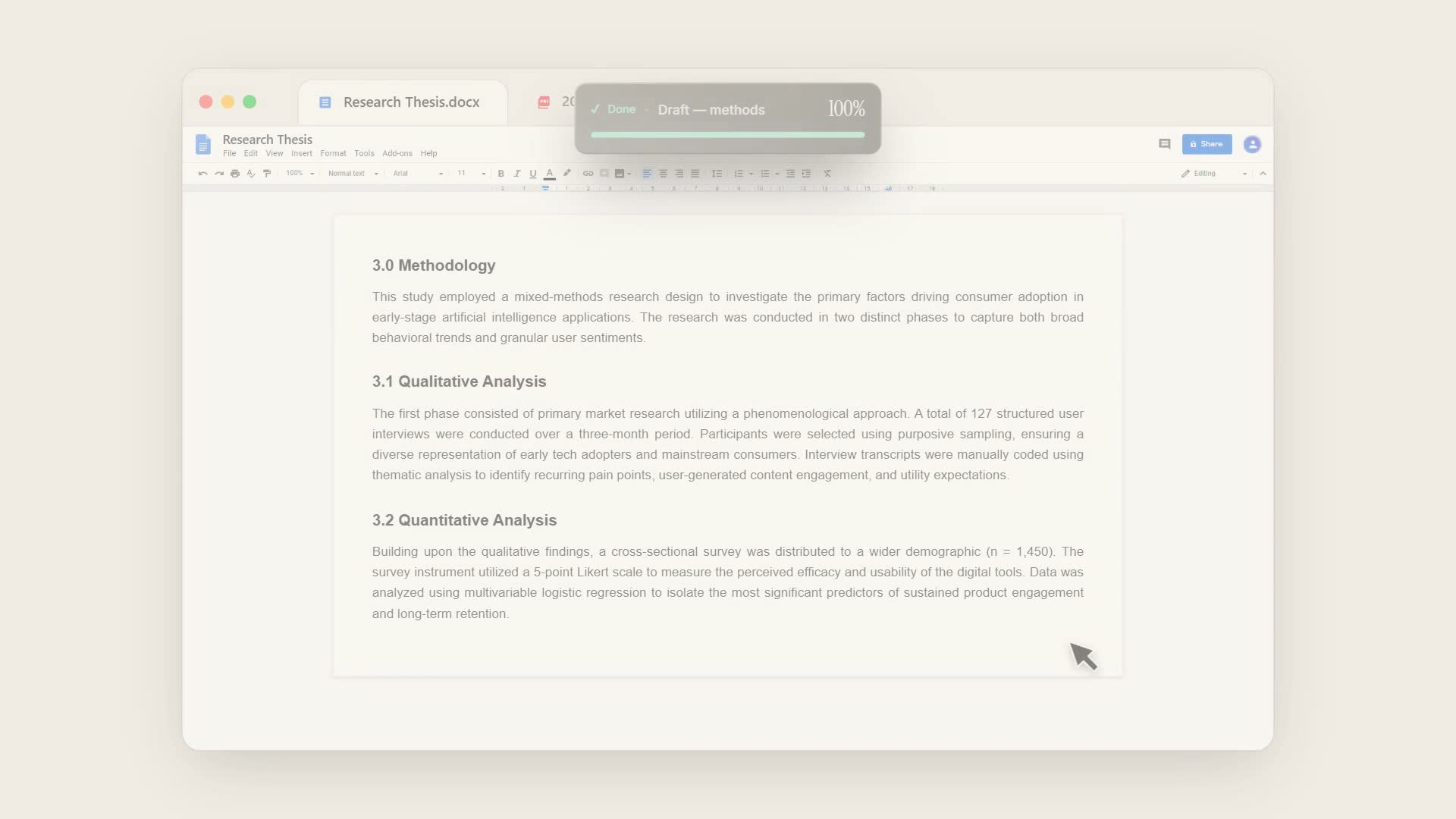
"The Progress Bar That Works." Plover is a small overlay that sits beside whatever window you're working in, breaks a goal into concrete steps, and quietly fills as the real work gets done.
Onboarding has to teach a mental model before it can sell a feature
The hard design problem wasn't the overlay itself — it was getting someone from "never heard of this" to "I trust a piece of software to watch my screen" in under two minutes, without a single support ticket about privacy. Three things had to happen before the user was left alone with an empty dashboard:
1. Prove the artifact before asking for anything
Telling someone "it's a progress bar for your brain" is abstract. Showing them the actual overlay component, live, on the first screen, is not.
2. Resolve the privacy objection at the exact moment it's raised
A screen-recording permission prompt is the single highest-anxiety moment in the whole flow. Burying the privacy pitch in a settings page later means the user has already made up their mind by then.
3. Make the first real task real, not a sandbox
A tutorial task that gets thrown away teaches nothing about daily use. The user's actual thesis chapter or actual feature needed to be the one being decomposed and tracked, on day one.
A 4-stage onboarding stepper: Welcome → Setup → First task → Done
Every screen in the stepper either teaches vocabulary the product will use later (observing, the fill bar, the step list) or resolves a trust objection at the moment it's most salient — so by the time the user reaches the empty Home screen, they already know what the bar means and why it's safe.
Welcome — show the real artifact, not a mockup
The screen splits in two: left is the pitch in plain language ("The Progress Bar That Works") with a single Get Started CTA, right is a live-playing demo of the actual overlay in motion. The user sees the real thing they're being sold before they've done anything.
Use case → Permission — a lightweight categorization step, then the trust pitch
"What tasks can Plover help you track?" — essays & papers, reading & research, problem sets, digital projects, daily study sessions — isn't friction for its own sake; it primes the AI decomposition step to feel tailored rather than generic. Then comes the screen we spent the most time on: "Now, let's turn it on," immediately paired with the guarantee that macOS's own permission dialog can't state on its own — Plover only reads the one window you pick, next.
First task — used for real, inside onboarding
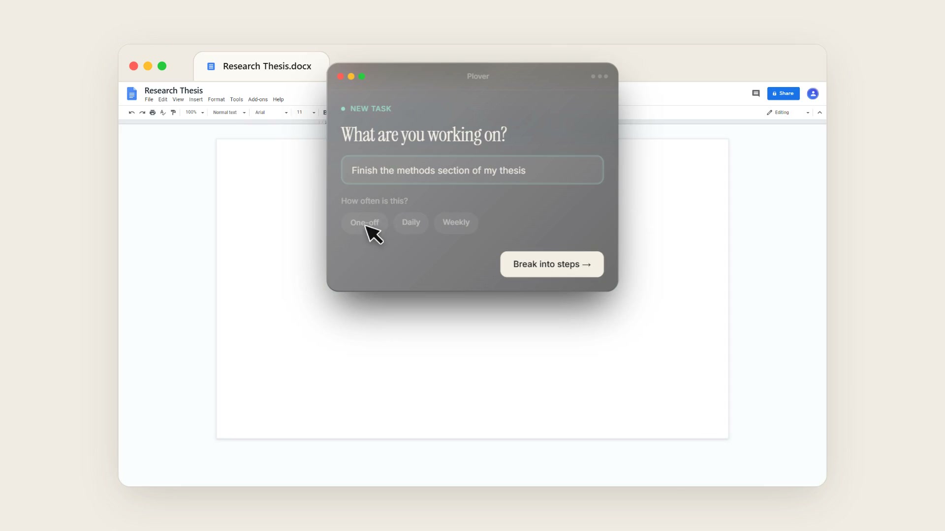
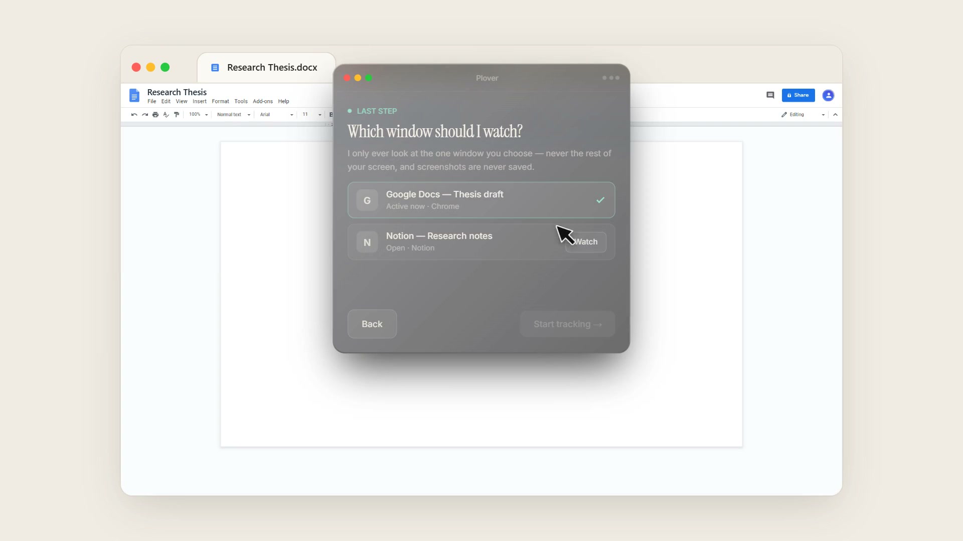
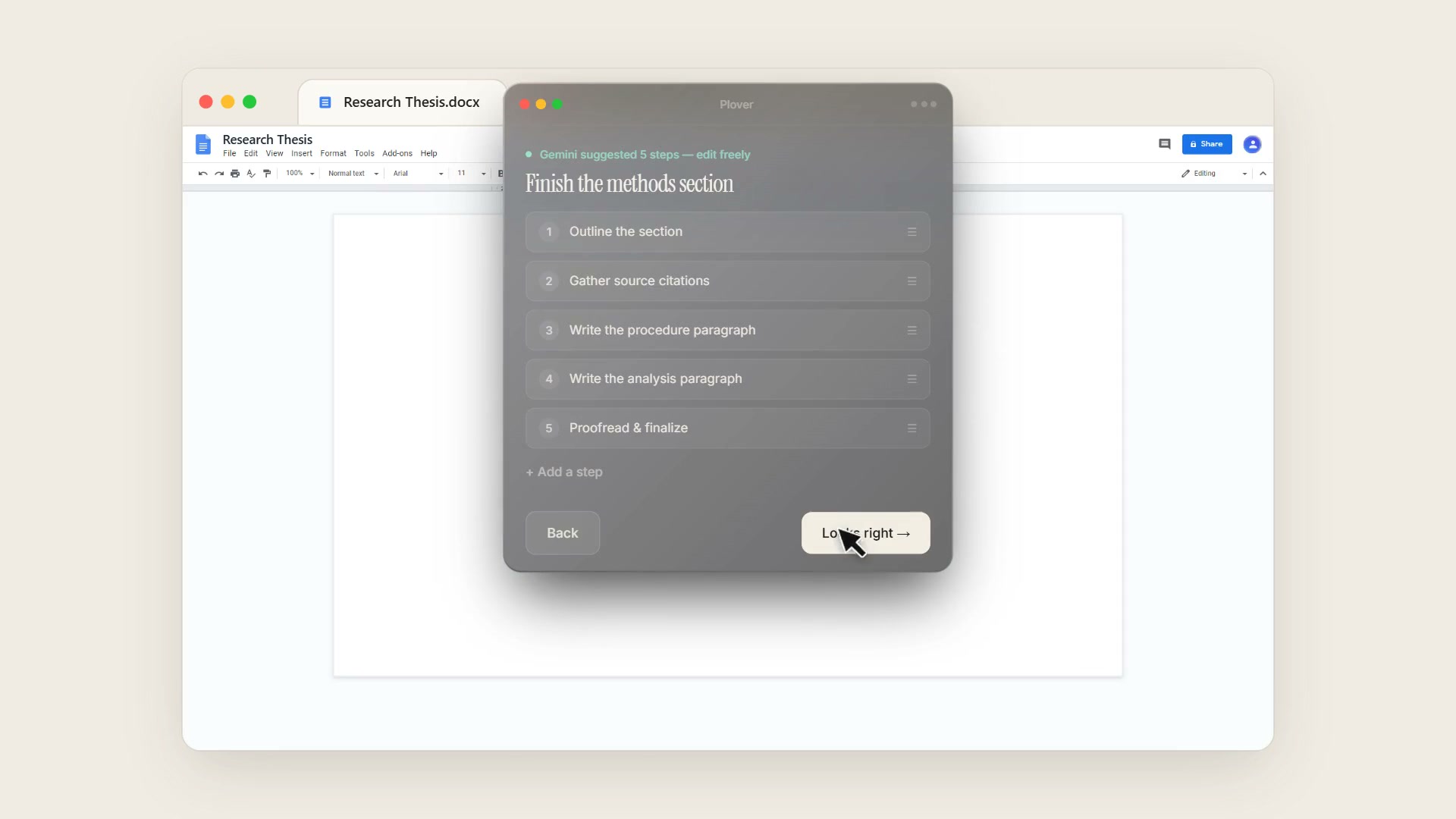
"Now let's start your first task," framed explicitly as "This is exactly how you'll use Plover every day," not a sandboxed tutorial. The user types a real goal ("Finish the methods section of my thesis"), picks a cadence — one-off, daily, or weekly — and hits Break into steps →, which fires the actual AI decomposition feature. Every generated step stays fully editable: renamed, reordered, deleted, or supplemented before tracking starts. The next screen asks one more real question — "Which window should I watch?" — with the same privacy line repeated in the user's own next decision: "I only look at the one window you pick — never the rest of your screen."
The overlay, the Home dashboard, and the Fitbit theory made literal
A Fitbit ring works because it closes the loop between an action you took and a number that moved, with almost no delay and almost no effort to report it. Plover is trying to build that same loop for tasks where the "sensor" isn't a heart-rate monitor but a permissioned read of the window you're actually working in.
A persistent overlay borrowed from fitness-app visual grammar
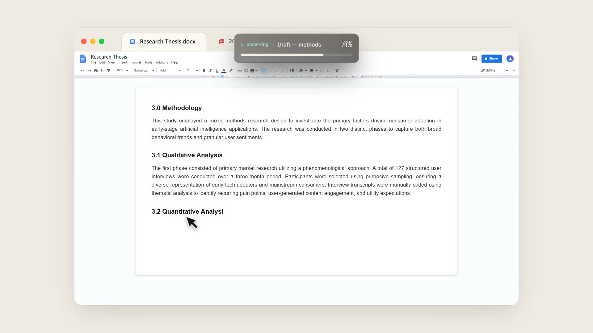
The core object is a small, collapsible, always-on pill carrying a status word (observing), a task name, a percentage, and a fill bar with a rounded, softly-glowing leading edge — closer to a charging ring than a flat progress bar. Expanding it reveals the step checklist underneath: each completed step gets a checkmark and strikethrough, the current step is marked now — the same visual grammar as a workout app's set-by-set breakdown.
Home extends the same idiom to every task at once
Tasks group by cadence — One-off, Daily, Weekly — each row a name, a fill bar, and a percentage, with the active task expanded inline to its step list. Daily and Weekly tasks reset their bar on cadence, mirroring a fitness app's ring resetting at midnight: progress is a living number tied to real cadence, not a static checklist you manually clear.
Privacy shipped as architecture, not a policy page
All user data lives in local SQLite. The only outbound calls are AI decomposition requests, proxied through a backend so no API key is ever exposed to the local build. That's the same claim the onboarding permission screen makes — visible in the codebase, not just the copy.
Built with architecture discipline, corrected by real usage
Plover was built from scratch around strict module boundaries: a pure Planner function (goal + context → subtasks), a typed store layer, and a Monitor/Inference/Nudge pipeline that's architected but deliberately not built yet — keeping the shipped phase scoped to capture → decompose → schedule → display.
What real usage caught that a spec couldn't:
In-progress tasks were being graded as skipped. The inference layer originally treated any task not marked done as abandoned. Fixing that — shipped as its own PR — came directly from watching how people actually leave tasks half-finished rather than in a binary complete/incomplete state.
The blended progress bar needed tuning after it shipped, not before. Folding the current step's own progress into the overall goal percentage, plus a toggleable "+X%" delta animation on completion, were designed, shipped, and then adjusted based on how the fill actually felt in daily use — the Fitbit-ring theory tested against a real, working build rather than staying a slide-deck idea.
Design principles that held up:
1. Teach the vocabulary before you need it. Every onboarding screen introduces a word or object the product will lean on later, so nothing in the empty-state Home screen is unfamiliar.
2. Resolve trust at the moment of friction, not before or after it. The privacy pitch works because it sits directly against the permission prompt — not in a settings page the user never opens.
3. Single-player by design. No team dashboard, no manager view, nothing saved. Progress that reflects only your own effort is the whole premise — a surveillance layer would have undone the trust the onboarding spends its entire flow building.